CSS Media Queries: Creating Responsive and User-Friendly Websites
Web Design
Welcome to Worden Design, a leading provider of professional website development services in the business and consumer services industry. In this article, we will explore the power of CSS media queries and their impact on website responsiveness and user experience. By understanding and implementing media queries effectively, you can ensure your website remains visually appealing and functional across different devices.
What are CSS Media Queries?
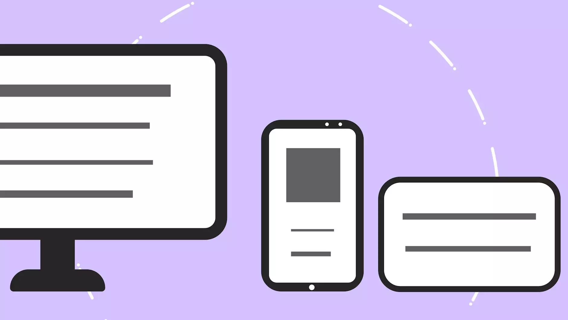
CSS media queries are a fundamental aspect of modern web development that allow web designers to tailor the layout and design of a website based on the characteristics of the device or screen size being used. Media queries use CSS rules to specify different styles for different devices or viewport sizes, enabling websites to adapt to various screens without compromising user experience.
Why are CSS Media Queries Important?
In today's digital landscape, where users access the web from a wide range of devices including smartphones, tablets, laptops, and desktops, it is crucial for websites to be responsive and adaptable. By employing CSS media queries, you can optimize your website's display and ensure seamless user experiences regardless of the screen size or device being used. This is especially relevant considering the ever-increasing popularity of mobile devices and the need for mobile-friendly websites.
Benefits of CSS Media Queries
CSS media queries offer numerous benefits that contribute to improved website performance and user satisfaction:
- Enhanced User Experience: By using media queries, you can customize the layout and design of your website to provide users with an optimal viewing experience on their specific device.
- Improved SEO: Responsive design, enabled by media queries, is a crucial ranking factor in search engines like Google. Websites that are mobile-friendly and adapt to different devices tend to perform better in search results.
- Cost and Time Efficiency: Rather than developing separate versions of your website for different devices, media queries allow you to create a single, responsive website that adapts to various screens. This saves development time and reduces maintenance costs.
- Expanded Reach: A responsive website with well-implemented media queries ensures that your content reaches a wider audience, regardless of the device or screen size they use.
- Future-Proofing: As new devices and screen sizes continue to emerge, using CSS media queries ensures your website can adapt without requiring extensive modifications or rebuilds.
How to Use CSS Media Queries
Implementing CSS media queries is a relatively straightforward process. It involves identifying breakpoints, which are specific screen sizes or ranges at which your website's layout and styles need to change. Here are some key steps to get you started:
- Identify Breakpoints: Analyze your website's design and content flow to determine the most suitable breakpoints. Common breakpoints include screen widths of 320px (mobile devices), 768px (tablets), and 1200px (desktops).
- Write Media Query Rules: Once you've identified breakpoints, you can create media query rules using CSS. For example, you might modify the font size, adjust the layout, or hide certain elements when the screen size falls within a specific range.
- Test and Refine: It's essential to thoroughly test your website across different devices and screen sizes to ensure the media queries function as intended. Make adjustments as needed to provide a seamless user experience.
The Future of CSS Media Queries
CSS media queries continue to evolve alongside advancements in technology and user expectations. With the rapid growth of mobile browsing and the emergence of new devices like smartwatches and smart TVs, media queries play a vital role in ensuring websites adapt to the changing digital landscape.
Looking ahead, the CSS Working Group is actively exploring new features and capabilities to further enhance media queries. These include support for detecting color schemes, device orientation, network conditions, and more. As a website owner, staying up to date with these developments and utilizing them effectively can give you a competitive edge in providing an exceptional user experience.
Choose Worden Design for Superior Website Development
At Worden Design, we specialize in website development and employ cutting-edge techniques like CSS media queries to create responsive and user-friendly websites for our clients. Our expert team of developers and designers will work closely with you to understand your unique requirements and deliver a website that stands out in terms of both aesthetics and functionality.
Whether you need a brand new website or want to revamp your existing one, Worden Design has the skills and experience to ensure your online presence effectively engages your target audience across various devices.
Contact Worden Design today to discuss your website development needs and take your online presence to new heights!


